Best T-Shirt and Ink Color Combinations for Every Occasion

Ever wonder why some t-shirts turn heads while others fade into the background?
It’s not just the design or the catchy slogan—it’s all about the color combo. The right T-shirt and Ink Color Combinations can take a simple print and turn it into something unforgettable.
At Tee Vision Printing, we’ve seen how the perfect pairing can level up any shirt—whether it’s for a community fundraiser, a fashion drop, or a big family reunion.
That’s why we put together this go-to guide to help you choose the best combos for every occasion.
Why T-Shirt and Ink Color Combinations Matter?
Color plays a powerful role in perception. According to the Institute for Color Research, as cited by Uxcel, people form subconscious judgments about an object, person, or environment within just 90 seconds of first seeing it, and between 62% to 90% of that impression is based solely on color.
Your color combo can:
Boost contrast and legibility
Improve emotional response
Strengthen brand recall
Increase visibility in events and photos
Best T-Shirt and Ink Combinations by Occasion
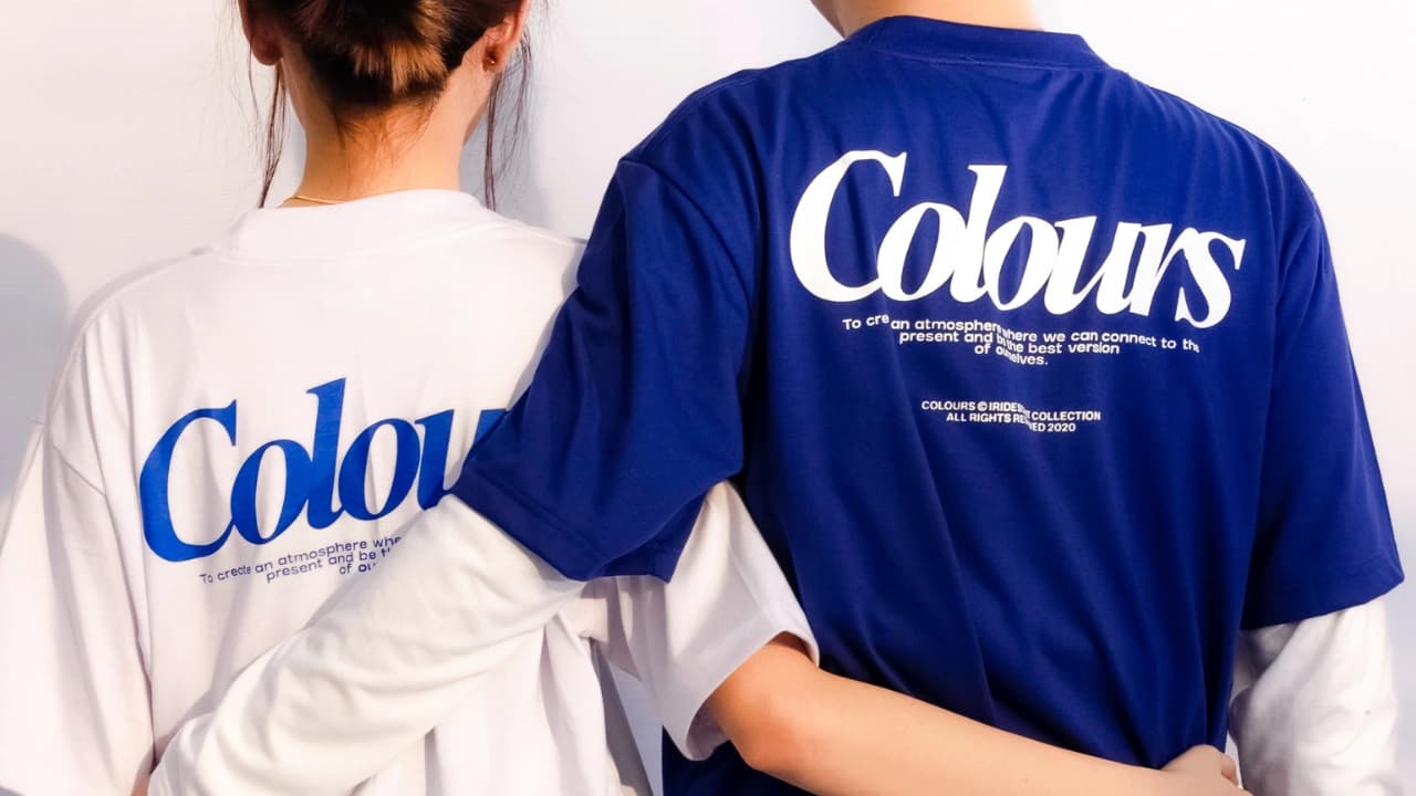
1. Black Shirt + White Ink
You can’t go wrong with black and white.
This combo delivers a sharp contrast that makes any design pop, day or night. It’s clean, bold, and works whether you're printing a logo, slogan, or detailed graphic.
One of the best t-shirt color combinations for anyone who wants something that looks good everywhere, every time.
Perfect for: Small businesses, staff uniforms, modern streetwear
2. White Shirt + Black Ink
Simple? Yes. Boring? Never.
This classic shirt color combination is cost-effective, high-contrast, and always professional. Black ink stands out clearly, even on large designs, which is why it’s a favorite for bulk printing and timeless branding.
Perfect for: Corporate giveaways, artist merch, promo tees
3. Red Shirt + Gold or White Ink
Red demands attention.
Pair it with gold for a premium feel, or white for strong contrast that shouts energy.
This color combination is great when you want your message to hit hard—think passionate campaigns or limited-edition merch.
Perfect for: Fundraisers, political events, fashion drops
4. Navy Shirt + Gray or Pastel Ink
Navy brings a polished look without being too stiff. Add soft gray or pastel ink, and suddenly your shirt says “approachable professional.”
This is a smart pick for brands that want to look confident and calm. One of the most underrated t-shirt colors for printing.
Perfect for: Business events, nonprofits, networking
5. Heather Gray Shirt + Neon Ink
Heather gray is low-key enough to let neon inks steal the show. Bright pinks, greens, or yellows burst off the fabric without overwhelming it.
This color combination is trendy, fun, and perfect for catching eyes on social media or at live events.
Perfect for: Art schools, music events, creative teams
6. Royal Blue Shirt + Yellow or White Ink
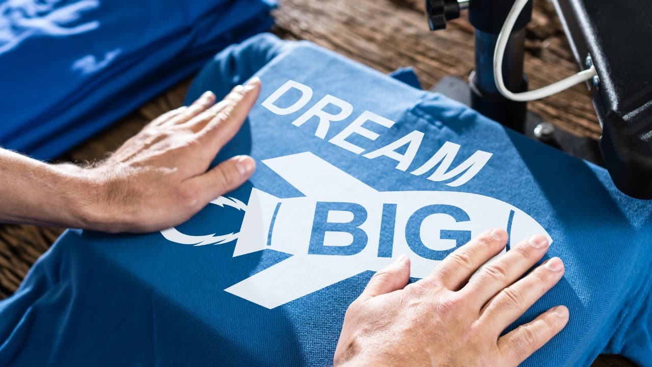
Royal blue already brings the energy, and when you add yellow or white ink, you get a look that’s bright, bold, and full of movement.
It’s a go-to for athletic teams and school gear, making it one of the most spirited t-shirt color combinations out there.
Perfect for: School spirit, team shirts, summer events
7. Neon Pink or Green Shirt + Black or White Ink
Trying to stand out in a crowd? Neon shirts get noticed fast. Add black or white ink for contrast, and your design stays readable even from far away.
It’s a smart move for outdoor events and awareness campaigns where visibility matters.
Perfect for: Fun runs, charity events, volunteer groups
8. Maroon Shirt + Gold Ink
Maroon and gold have that rich, classic vibe.
They say “established” and “elegant” without being over the top.
This shirt color combination is a hit for school-related apparel, honor societies, or anyone who wants to give off a timeless look.
Perfect for: Alumni events, academic gear, senior shirts
9. Ash Gray Shirt + Navy Ink
Ash gray is soft, neutral, and works on everyone. Navy ink adds just the right amount of depth without being too bold.
It’s one of those color combinations that feels balanced and easy, great for group tees that need to look good on all ages.
Perfect for: Family reunions, church groups, community events
10. Forest Green Shirt + Cream Ink
This combo feels grounded and natural.
Forest green brings that earthy vibe, and cream ink keeps things soft and warm. Perfect for sustainability-focused brands or any event with a rustic, outdoor theme.
A top pick for nature lovers looking for the right t-shirt colors for printing.
Perfect for: Outdoor retreats, eco brands, farmers’ markets
Common Color Pairing Mistakes to Avoid
Low Contrast: Avoid ink colors that blend into the shirt.
Light on Light: Yellow ink on white doesn’t show well.
Too Many Colors: Makes the design messy and increases printing costs.
Wrong Fabric: Not all inks behave the same on blends vs. cotton.
How to Choose the Right Ink for Your Shirt
Picking the right ink isn’t just about what looks good—it’s about what works best for your design, fabric, and printing method. Here’s how to get it right:
1. Match the Mood
Let your design speak through color.
Bright inks like red, yellow, or gold bring energy, perfect for events or promos.
Muted tones like cream, gray, or sage feel calm and modern, great for lifestyle brands.
Classic combos (white on black, black on white) work anywhere.
Pick an ink color that fits the vibe of your message.
2. Pick the Right Print Method
Different print methods = different results.
Screen Printing: Great for bold, solid colors and larger orders. It creates vibrant, durable designs that pop, but each color adds to setup time and cost.
Direct-to-Garment (DTG: Best for complex or full-color artwork. Think gradients, photos, or detailed illustrations—especially when printing in small batches.
Tee Vision Printing offers both, and we’ll guide you to the right one for your project.
3. Consider the Fabric
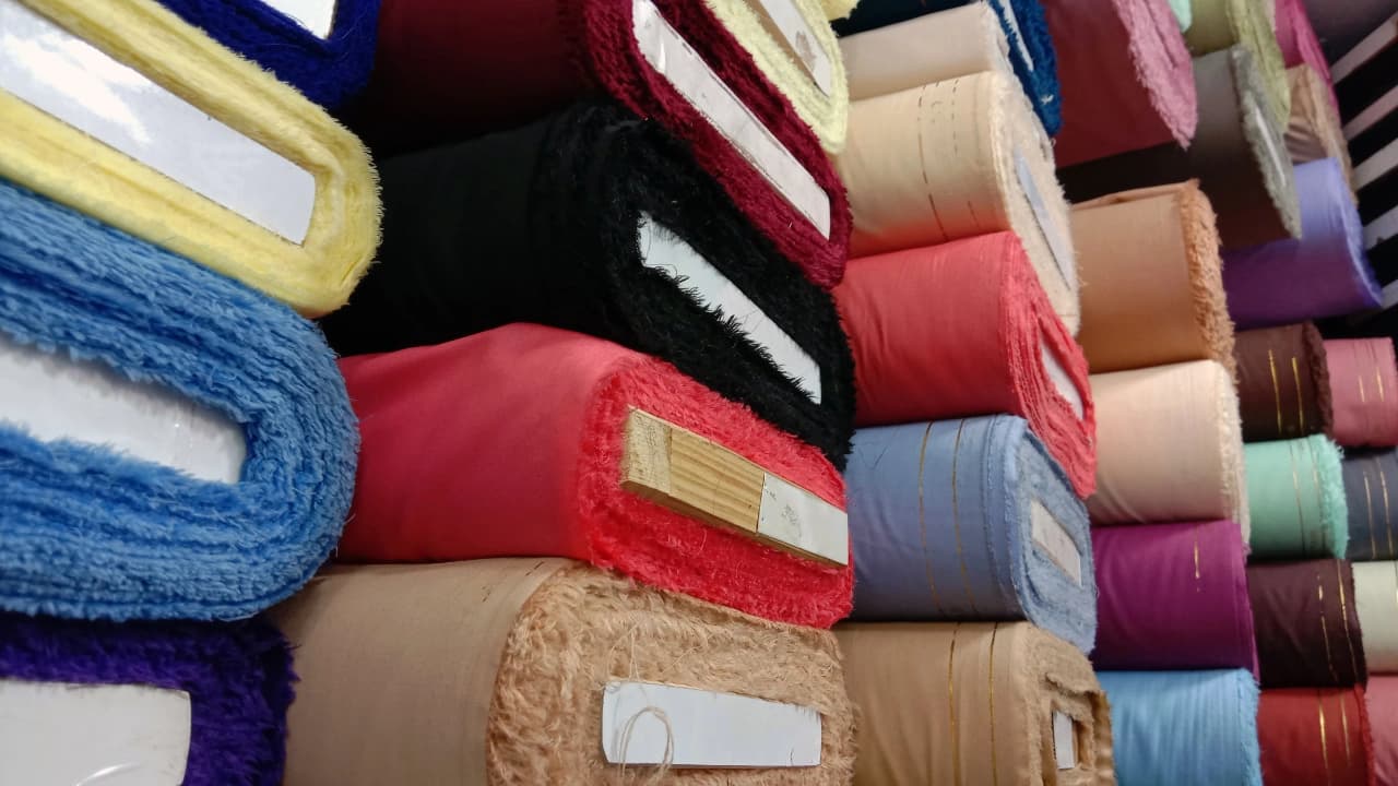
The right fabric material changes how ink behaves.
100% Cotton is ideal—great ink absorption and sharp prints.
Cotton Blends are soft and durable but may require a white underbase for colors to stay bright.
Tri-blends/Performance Fabrics need special treatment to keep prints looking sharp.
Not sure which to use? We’ll recommend the best blanks for your design and budget.
4. Always Preview First
Mockups are your best friend. What looks good on screen might not work on fabric. Lighting, shirt color, and ink all play a role.
Tee Vision Printing offers free mockups so you can visualize everything before going to print.
FAQ: T-Shirt and Ink Color Edition
Q1: How many ink colors should I use?
Stick to 1–3 for visual clarity and cost-efficiency.
Q2: What shirts work best for full-color designs?
Light-colored shirts like white or gray are best for DTG.
Q3: Can I use dark ink on dark shirts?
Yes, but a white underbase is required.
Q4: Does fabric affect color?
Yes! Cotton holds color better than blends.
Q5: Can you help with choosing colors?
Of course! Tee Vision Printing offers design consultations and mockups.
Ready to Bring Your Color Vision to Life?
Choosing the right t-shirt and ink combination is more than a design step—it’s how your message shines.
Let Tee Vision Printing help you find the perfect combo. Whether you're creating event merch, fashion drops, or team tees, we’re here to make sure your design hits right.
Get started now at Tee Vision Printing


